I was in high school. I had never used eyeshadow before. I chose blue to spend my money on.
No surprise, it never got used, but don't be like me! Use that color! I know it secretly makes you happy (while also causing heart palpitations from fear when you even think about using it).
All you closeted color lovers out, embrace that inner bright pigmented yearning and say "Dash it, all! I'm wearing ORANGE (insert other bright color here) today.....very sneakily in a corner of the eyes so no one but I will know the extent to which I can dare". Color can be scary and using highly pigmented, outrageously gorgeous and bright colors like the Kat Von D Metal Crush Shadows* ($25CDN, 0.10oz ) is even more frightening. But once you've swatched these babies, only an an-hedonist could resist.
So, in case you get trapped by how wonderfully god-damn buttery these shades are OR need a little push to finally pick up that matte magenta in the bottom of your drawers, here are a few ways I tend to safely become one with the eye-colors.
All tips were used with the base colors of Strutter and Vox from the Kat Von D Mi Vida Loca Remix Palette. Color can easily be incorporated into neutrals you already have! Baby steps, I started with one color incorporation at a time.
1) Outer Corner Shade
Best for: Darker colors
Color example: Kat Von D Danzig*
This is the straight forward addition of your choice color only into the outer third of your eyes and blended up into the crease. This was my gateway into using color. Slap neutrals on your lids and add that purple right on the outer edge. You can control how much or how little you'd like to use but utilizing the outer third is a nice way to showcase a beautiful purple.
(Some people are still afraid of purple...and pink...its pink, guys...the color of cotton candy and fairies...)
2) Inner Corner Placement
Best for: lighter and brighter colors.
Color example: Kat Von D Electric Warrior*
Inner corners don't offer a lot of space, but that's perfect for really bright (scary) colors. You aren't forced to cover lots of real estate and the color will really stand out since it is so precisely placed and focused. You can also choose to blending or using less pigment. Something bright and acid green like Electric Warrior then turns into a pretty mustard shade that is a paler, yet still unique, impression of itself.
3) Incorporating into Liner
Best for: Any color!
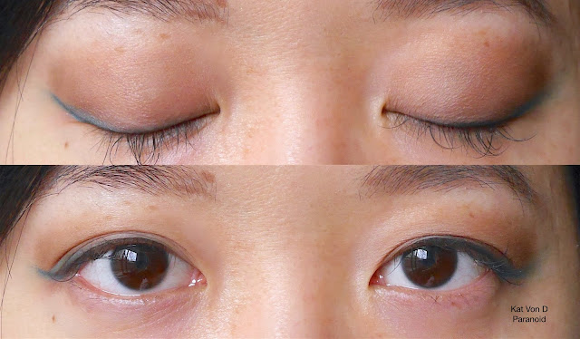
Color example: Kat Von D Paranoid*
I do this often with dark purples and blues. Super bright blues and greens are scary to place on a large area so targeted lining is an option. Line your whole lash line or just the outer wing, like I've done here. Don't forget you have the option of the lower lash line as well! I love golds, pinks, white and other brighting shades like that for the lower lash.
4) Blend/Smokey It Out
Best for: Any shade
Color example: Kat Von D Raw Power*
This is slightly different from Tip 1. Here, you are really concentrating the color onto the bottom third of your lid, an area most people will never see when your eyes are open. I repeatedly packed on Raw Power there, then took the same brush, dipped it into Strutter (neutral light matte tan/brown shade) and blended from the edge up and into the crease. Placing Strutter overtop Raw Power toned down the metallic shimmer and softened the red. Continue to buff (and buff...and buff) until you get a comfortable gradient. You can even reapply your choice color on the lower third to re-intensify. Go crazy there!! Your eyes are open all the time, no one will ever really see it!
5) Just Do It.
(one day...just go for it)
(I know you want to)
(I know you want to)
If you combined all above ideas, you'd get:
BAM. Color.
And actually, it looks pretty awesome in real life.
How afraid of color are you? Specific colors? All colors?


0 comments:
Post a Comment